CSS formatting
Discover the secrets of CSS formatting and master the box model, a fundamental element for creating harmonious and professional web interfaces. This training will enable you to understand and effectively use the margin, padding, border, and box-sizing properties.
Educational objectives
- Explain how cascading style sheets work and their role in web presentation
- Create inline styles and understand their priority in the CSS cascade
- Effectively use CSS selectors to target HTML elements
- Mastering the components of the box model (margin, padding, border)
- Solve common problems related to box model and margin merging
The CSS box model: a fundamental architecture
Each HTML element is represented as a rectangular box composed of four distinct areas: the content, the padding, the border, and the margin. This representation, called the CSS box model, is crucial for understanding how elements are sized and positioned on a web page. The content forms the core of the element where the text and other child elements are displayed. The padding creates space between the content and the border, visually giving the element breathing room. The border forms the visible outline of the element, while the margin establishes the spacing with adjacent elements.
Visualization and calculation of dimensions
Understanding the box model is essential for mastering element sizing. By default, the width and height defined in CSS only apply to the content area. Therefore, the total dimensions of an element include the content plus padding, border, and possibly margin. This peculiarity can surprise beginners who expect that `width=200px` will produce an element 200 pixels wide in total. Browser developer tools offer a graphical visualization of the box model, which is particularly useful for diagnosing layout problems.
Key point Each HTML element follows the box model: content + padding + border + margin, from the inside out.
Key points to remember
The CSS box model structures each element into four concentric zones: content, padding, border and margin, thus determining the dimensions and spacing of the elements.
🎯 Mini-exercise: Visualize the box model
Create a box with content, padding, a border, and margins to observe how each property affects the appearance and dimensions of the element.
Reference code:
<div class="box-model-demo">
  <p>Box contents</p>
</div>

<div class="reference">
  <p>Reference element</p>
</div>
.box-model-demo { width: 200px; height: 100px; padding: 20px; border: 5px solid #667eea; margin: 30px; background-color: #f0f4ff; text-align: center; } .reference { width: 200px; height: 100px; background-color: #ffe0e0; border: 1px dashed #ff6b6b; text-align: center; } body { font-family: Arial, sans-serif; padding: 20px; }
Monaco Editor v0.45
The padding property: the interior space
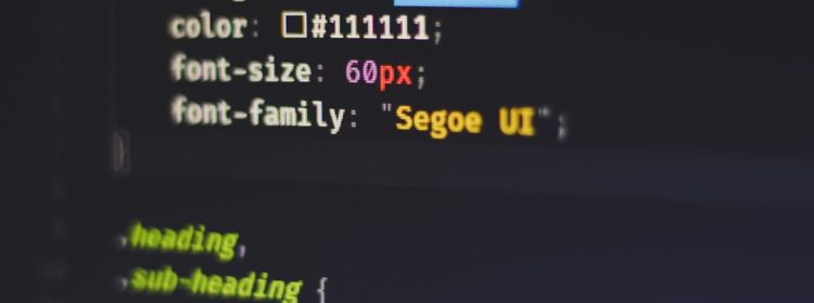
Padding defines the space between an element's content and its border. This property is particularly useful for improving readability by preventing text or child elements from directly touching the edges of their container. Padding can be defined in several ways: with a single value (padding: 20px) that applies to all four sides, with two values (padding: 20px 10px) for vertical and horizontal orientations, or with four distinct values (padding: 10px 20px 30px 40px) in the order top, right, bottom, left. There are also specific properties `padding-top`, `padding-right`, `padding-bottom`, and `padding-left` for precise control over each side.
The margin property: the outside space
The margin controls the space around an element, creating a transparent area that separates it from its neighbors. Unlike padding, the margin is not part of the element's background and always remains transparent. The syntax is identical to that of padding, but the margin exhibits special behaviors, such as merging vertical margins between adjacent elements. An important feature is the ability to use negative values to create overlaps or specific visual effects. The `auto` value for the margin, in particular, allows you to horizontally center an element of a defined width.
The border property: the visible border
The border forms the visible boundary of the element and is located between the padding and the margin. A complete border requires three properties: width (border-width), style (border-style), and color (border-color). The shorthand syntax `border` allows you to define these three values in a single declaration (e.g., `border: 2px solid #333`). Border styles include solid, dashed, dotted, double, groove, ridge, inset, and outset. Each side can have its own border with `border-top`, `border-right`, `border-bottom`, and `border-left`. The `border-radius` property allows you to round the corners to create modern visual effects.
Key point Padding = interior space, Margin = exterior space, Border = visible boundary between the two.
Key points to remember
Padding creates the interior space, margin the exterior space, and border the visible boundary. Each property can be defined globally or individually per side.
🎯 Mini-exercise: Create varied spacing
Experiment with different margin, padding and border values on several elements to observe their visual effects and interactions.
Reference code:
<div class="container">
  <div class="box box-1">Important padding</div>
  <div class="box box-2">Significant margin</div>
  <div class="box box-3">Stylish border</div>
</div>
.container { background-color: #f8f9fa; padding: 20px; } .box { width: 150px; height: 80px; background-color: #e3f2fd; text-align: center; line-height: 80px; margin-bottom: 10px; } .box-1 { padding: 30px 15px; border: 2px solid #2196f3; } .box-2 { margin: 40px 20px; border: 1px solid #4caf50; background-color: #e8f5e8; } .box-3 { padding: 15px; border: 5px dotted #ff9800; border-radius: 10px; background-color: #fff3e0; }
Monaco Editor v0.45
The problem with the traditional box model
By default, CSS uses the "content-box" model, where the width and height properties apply only to the element's content. This means that the final dimensions include padding and border in addition to the defined width, which can complicate layout calculations. For example, an element with width: 200px, padding: 20px, and border: 5px will have a total width of 250px (200 + 20*2 + 5*2). This logic, while technically sound, is counterintuitive for many developers who expect width to represent the element's full visible width. This behavior can cause unexpected overflows and complicate the creation of accurate layouts.
The box-sizing solution: border-box
The `box-sizing: border-box` property fundamentally changes how dimensions are calculated. With this value, `width` and `height` include the content, padding, and border, but exclude the margin. This approach is much more intuitive because it corresponds to our natural perception of an element's size. An element with `width: 200px` and `box-sizing: border-box` will always be exactly 200px wide, regardless of the padding and border values. The content will automatically adjust to accommodate these internal spaces. This property has become so popular that many CSS frameworks apply it globally with the universal selector.
Recommended global implementation
The best practice is to apply `box-sizing: border-box` to all elements from the start of a project. The recommended technique uses the universal selector and pseudo-elements: `*`, `*::before`, `*::after` { `box-sizing: border-box; }`. This approach ensures consistency throughout the project and greatly simplifies layout calculations. Some developers prefer a more conservative approach by setting `box-sizing: border-box` on the `<html>` element and using inheritance, allowing for local exceptions if needed. This property does not affect margins, which continue to be added to the element's dimensions.
Key point : box-sizing: border-box means that width includes content + padding + border, making calculations more intuitive.
Key points to remember
box-sizing: border-box changes the dimension calculation to include padding and border in width/height, greatly simplifying layout.
🎯 Mini-exercise: Compare box models
Create two identical elements with different box-sizing values to observe how this affects their final dimensions.
Reference code:
<div class="comparison">
  <div class="box content-box">
    <h3>content-box (default)</h3>
    <p>Width: 200px<br>Total width: 250px</p>
  </div>

  <div class="box border-box">
    <h3>border-box</h3>
    <p>Width: 200px<br>Total width: 200px</p>
  </div>
</div>
.comparison { display: flex; gap: 30px; flex-wrap:wrap; background-color: #f5f5f5; padding: 20px; } .box { width: 200px; padding: 20px; border: 5px solid #333; background-color: white; text-align: center; font-family: Arial, sans-serif; } .content-box { box-sizing: content-box; border-color: #e74c3c; } .border-box { box-sizing: border-box; border-color: #27ae60; } .box h3 { margin: 0 0 10px 0; color: #333; font-size: 16px; } .box p { margin: 0; font-size: 14px; color: #666; }
Monaco Editor v0.45
Understanding the merging of vertical margins
Margin collapsing is a CSS behavior specific to vertical margins where two adjacent margins combine to form a single margin. This occurs in three main situations: between adjacent sibling elements, between a parent and its first/last child, and on empty elements. For example, if one element has `margin-bottom: 30px` and the following element has `margin-top: 20px`, the space between them will be 30px (the larger of the two) and not 50px as one might expect. This logic, inherited from the layout of text documents, aims to avoid excessive spacing between paragraphs and other content elements.
Special cases and exceptions
Margin merging only applies to the vertical margins (top and bottom) of normal flow elements (display: block). Horizontal margins never merge, nor do the margins of floated, absolutely positioned, or display-specific elements such as inline-block, flex, or grid. The parent-child relationship is particularly problematic: the top margin of the first child merges with the top margin of the parent, potentially creating unexpected effects where the spacing appears to "bounce up" above the parent container. This merging does not occur if the parent has padding, a border, or certain properties like overflow other than visible.
Techniques to avoid melting
Several strategies can be used to control or prevent margin merging depending on the context. Adding minimal padding to the parent element (padding: 1px 0) prevents merging with its children. Using `overflow: hidden` on the parent element creates a new formatting context and blocks merging. Modern layout techniques like Flexbox and CSS Grid naturally eliminate this problem. For precise spacing, padding can be used, or margin can be combined with a transparent border. In some cases, using `display: inline-block` or adding a pseudo-element with content can resolve merging issues while preserving the desired layout.
Key point : Adjacent vertical margins merge automatically, keeping only the largest value.
Key points to remember
Margin merging only applies to adjacent vertical margins which combine into a single margin equal to the larger of the two values.
🎯 Mini-exercise: Observe the merging of margins
Create elements with different vertical margins to observe the merging phenomenon and test solutions to avoid it.
Reference code:
<div class="demo-section">
  <h3>Margin merging (default)</h3>
  <div class="element margin-30">Margin-bottom: 30px</div>
  <div class="element margin-20">Margin-top: 20px</div>
</div>

<div class="demo-section no-collapse">
  <h3>No merging (parent padding)</h3>
  <div class="element margin-30">Margin-bottom: 30px</div>
  <div class="element margin-20">Margin-top: 20px</div>
</div>
.demo-section { margin-bottom: 40px; background-color: #f8f9fa; border: 2px dashed #dee2e6; } .demo-section h3 { margin: 0; padding: 10px; background-color: #343a40; color:white; font-size: 14px; } .no-collapse { padding: 1px 0; /* Prevent merging */ } .element { padding: 15px; background-color: #e9ecef; border: 1px solid #adb5bd; text-align: center; font-family: Arial, sans-serif; font-size: 14px; } .margin-30 { margin-bottom: 30px; background-color: #ffebee; border-color: #f44336; } .margin-20 { margin-top: 20px; background-color: #e8f5e8; border-color: #4caf50; }
Monaco Editor v0.45
The fundamental CSS selectors
CSS selectors allow you to precisely target HTML elements to style. The element selector (p, div, h1) targets all elements of the specified type. The class selector (.my-class) targets elements with the corresponding class attribute, while the ID selector (#my-id) targets a single element with the specified id attribute. Selectors can be combined: p.intro targets paragraphs with the class "intro", div1TP5Header targets a specific div with the ID "header". Descendant selectors (div p) allow you to target nested elements, while direct child selectors (div > p) target only immediate children. This flexibility allows for very precise control over formatting.
Inline styles and their priority
Inline styles are defined directly in the style attribute of the HTML element (<div style=" »color:" red; »>This method has the advantage of simplicity and immediacy, particularly useful for quick tests or very specific styles. However, inline styles have very high specificity in the CSS cascade, meaning they override virtually all other styles defined in external or internal stylesheets. This high priority can make maintenance and subsequent modifications difficult, as it becomes complicated to override these styles without using !important or other inline styles.
CSS cascading and best practices
The CSS cascade determines which styles apply when multiple rules target the same element. The order of precedence follows this logic: inline styles (highest specificity), IDs, classes and attributes, then elements. If specificity is equal, the last declared rule takes precedence. Best practices recommend avoiding inline styles in favor of reusable CSS classes, organizing stylesheets logically, and prioritizing natural specificity over !important. A well-designed CSS architecture uses a consistent naming convention (like BEM) and clearly separates structure (HTML) from presentation (CSS), thus facilitating project maintenance and evolution.
Key point : CSS selectors allow for precise targeting, but inline styles have a very high priority in the cascade.
Key points to remember
CSS selectors offer targeting flexibility, but inline styles, while convenient, have high specificity that can complicate maintenance.
🎯 Mini-exercise: Testing selectors and specificity
Create elements with different selectors and inline styles to observe how the CSS cascade determines the styles applied.
Reference code:
<div class="container">
  <h2>CSS Specificity Test</h2>

  <p class="text-style">Paragraph with class (green)</p>

  <p class="text-style" id="special-text">Paragraph with class + ID (blue)</p>

  <p class="text-style" style="color: red;">Paragraph with inline style (red)</p>

  <div class="box-demo">
    <p>Paragraph within a div (orange by inheritance)</p>
  </div>
</div>
/* Element selector - low specificity */ p { color: gray; font-size: 16px; margin-bottom: 10px; } /* Class selector - medium specificity */ .text-style { color: green; font-weight: bold; } /* ID selector - high specificity */ #special-text { color: blue; text-decoration: underline; } /* Descending selector */ .box-demo { color: orange; background-color: #fff3e0; padding: 15px; border-radius: 5px; border: 2px solid #ff9800; } .container { font-family: Arial, sans-serif; max-width: 600px; padding: 20px; } .container h2 { color: #333; border-bottom: 2px solid #667eea; padding-bottom: 5px; }
Monaco Editor v0.45
Summary
Key points to remember
- Box model Each element follows the structure content + padding + border + margin
- Spacing properties Padding (inside), margin (outside), and border (visible border) control the layout
- Box-sizing border-box Includes padding and border in the width/height dimensions for intuitive calculations.
- Margin merging Adjacent vertical margins automatically combine, keeping the largest value
- Cascade CSS Inline styles have the highest priority, followed by IDs, classes, and then elements.
Sources
To deepen your knowledge:
Validate your knowledge
Test your understanding with this 10-question quiz:
