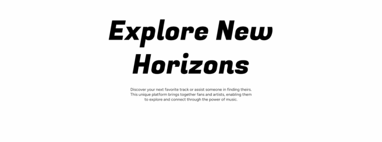
Hero Banner: Alternatives and trends for a more impactful design
In 2025, when we redesigned the Usabilis website, the question of the hero banner quickly arose. Should we still use one? Is it still relevant or just a habit inherited from the web of the 2010s? We questioned everything: the readability of the text on the images, the […]
The article…
Educational objectives
- Understanding the key concepts of "Hero Banner: alternatives and trends for more impactful design"«
- Apply this knowledge to your UX/UI projects
In 2025, when we redesigned the Usabilis website, the question of the hero banner quickly came up.
Should we still include one? Is it still relevant or just a habit inherited from the web of the 2010s?
We questioned everything: the readability of the text on the images, the space it occupies, its real impact on conversion. “What if we dared to do something else?” we asked ourselves.
Between functional rigor and the need for immersion, the need to tell who we are, to humanize the agency, we had to find the right balance.
How to reconcile performance and emotion? Here are the alternatives we explored before clicking “Publish”.
Rethinking the role of the Hero Banner in 2025
A legacy of the 2010s web
Pendant des années, la hero banner a été l’élément “immanquable” des pages d’accueil : une image large, un slogan, un call-to-action. Un modèle venu du web éditorial, pensé pour un usage desktop, où l’image jouait le rôle de scène d’ouverture. En 2025, cet héritage continue d’influencer de nombreux sites… parfois par automatisme. Or les comportements ont évolué : les visiteurs scannent plus qu’ils ne lisent, 60 à 70 {4a00f6d73ff9e2f537053b7c202ea3e7e3a1709f4630047a1912e510d35e71a5} des consultations se font sur mobile, et la première impression se joue désormais autant dans la clarté que dans la rapidité d’affichage.
Between storytelling and performance: a delicate balance
A well-designed hero banner can establish a world, deliver a powerful message, and embody the brand from the very first seconds. But this promise comes with very real constraints: it's often the heaviest element on the page, and therefore the most impactful for Core Web Vitals. On mobile, it monopolizes the screen before it has provided any useful information.
And above all, it suffers from banner blindness: as UX Planet points out, users tend to ignore large home screen images, now associated with advertising blocks.
In other words, the image of a hero banner can be spectacular… and completely ineffective.
Why are some sites abandoning it?
Faced with these limitations, more and more design teams are choosing to lighten, or even eliminate, the grand image of openness in favor of more understated and efficient approaches.
Several trends are converging:
- The quest for clarity: understanding the offer at a glance becomes more important than visual impact.
- Speed as a quality criterion: a fast site converts better than a "beautiful but slow" site.
- Mobile-first: a purely typographic header reads better than a cropped full-screen photo.
- Minimalist design: more typography, more white space, more modularity.
By 2025, the hero banner is no longer a default standard.
It's a strategic choice, which depends on the message, the context, and actual uses.
7 alternatives to the classic Hero Banner
While the large image has long been the standard entry point for home pages, it is no longer necessarily the most suitable solution. Practices have evolved, and other layouts now allow for greater readability, faster speed, and sometimes more persuasive communication. Here are the alternatives that we see most often in recent projects.
1. The typographic header: saying more with less
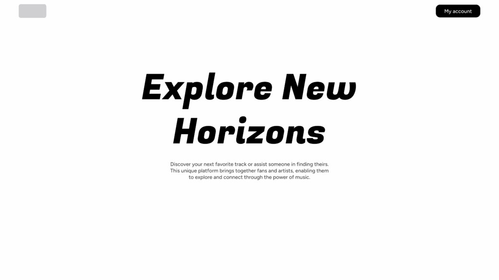
Example of a typographic banner
Many websites now prioritize a clear title and careful layout over a full-width image. Well-chosen typography is often enough to set the tone, especially for digital products.
Why it works: The message arrives immediately, without distraction, and the page remains very efficient. This is a consistent choice when the value proposition is based primarily on understanding.
2. Split screen
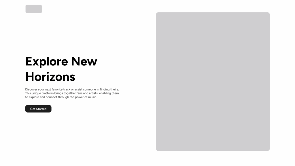
Example of split screen
Split screen balances text and visuals without one dominating the other. We gain in readability, while retaining a useful visual support (illustration, product photo, screenshot).
Main interest: The layout remains stable on both desktop and mobile, with few cropping issues to manage.
3. Illustration or lightweight 3D
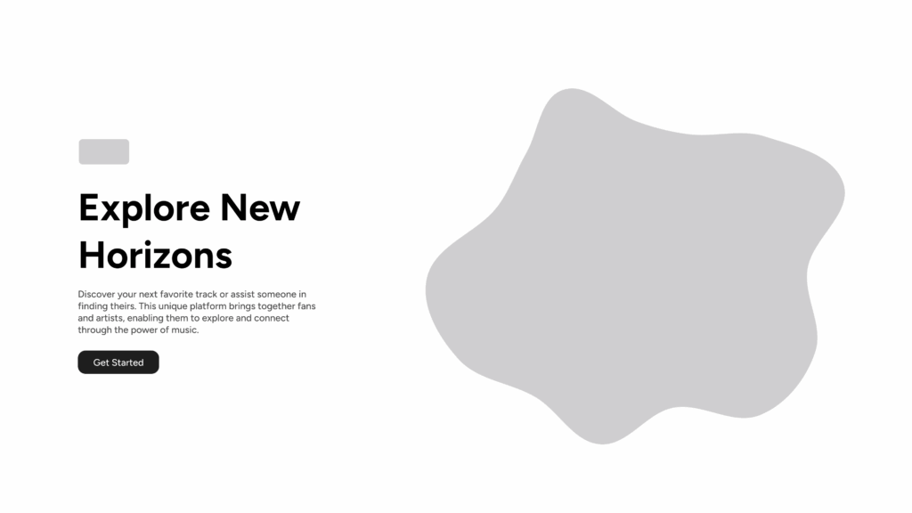
Example of a banner with illustration
Illustration, whether vector or simple 3D, allows you to create an atmosphere without depending on a photograph. It adds character to the site while remaining more flexible and lighter.
Key points to remember: The illustration should serve the explanation, not add decoration.
4. Very short video storytelling
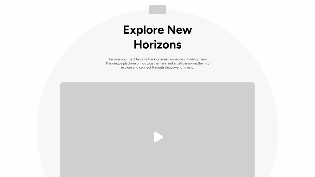
Example of a banner with video
When properly executed, a micro-video (a few seconds, silent) can effectively replace an image. It shows a gesture, a custom, a situation — something that a photo cannot convey so quickly.
Attention It should remain discreet and optimized. Too much video becomes a distraction.
5. The modular experience
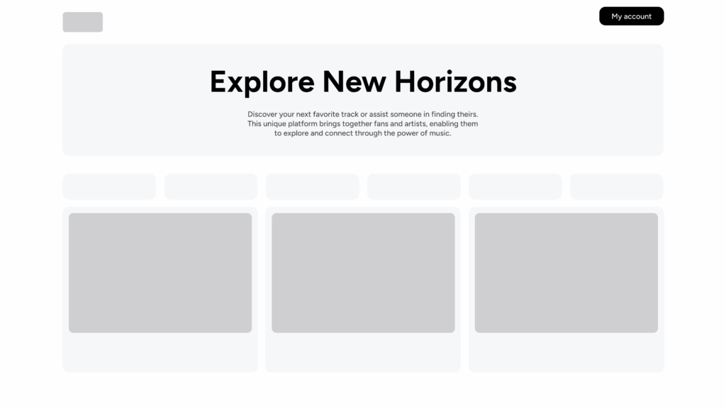
Banner with a modular experience
Some sites completely abandon the idea of a single “hero” and instead offer a succession of small modules: a title, a key phrase, a simple visual, social proof.
The rationale behind this choice: The content is gradually introduced, without focusing all attention on a single block. This is an interesting approach when the product or service requires a minimum of context before it can be understood.
6. The “minimal hero”
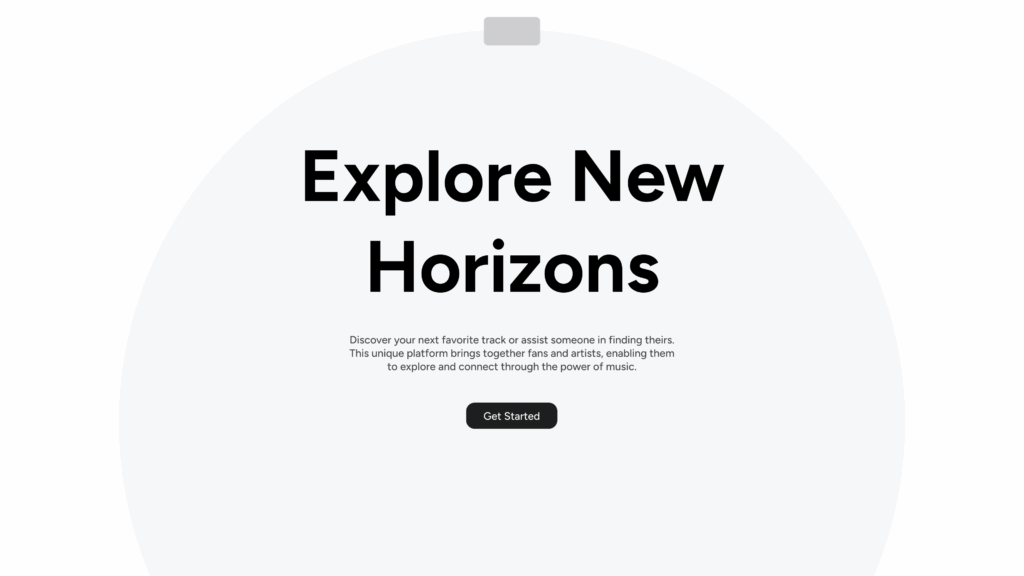
Example of a minimal banner
A clean layout, a neutral background, a precise title, a single CTA. Nothing superfluous.
Advantage : It's readable, fast, and very direct. This is often what works best to improve the conversion rate.
7. The human approach
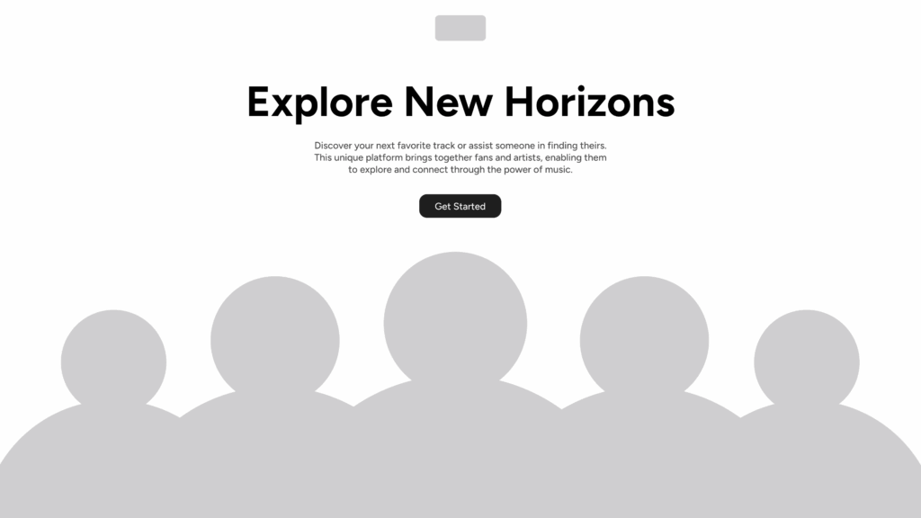
Banner with a human approach
Team photos, portraits, testimonials… Some organizations choose to put the human element first from the very first seconds, especially when selling a service or support.
Objective : to establish trust immediately, without artifice.
Performance, accessibility and SEO: criteria not to be overlooked
When redesigning a header, we always come back to the same question: what will the user perceive first, and under what conditions? A header that is too heavy or difficult to read doesn't just have an aesthetic impact. It affects the speed, comprehension, and even the credibility of the page. This is often where the first impression, the real one, is made.
Loading time and Core Web Vitals
In most projects, the main header element is also the largest file size. A high-definition image, a background video, or even a poorly exported illustration is enough to slow down Largest Contentful Paint. This is immediately apparent in the technical tests, but especially in the user behavior: the page It takes a second too long and the user is already gone elsewhere.
Our approach is simple: choose the right format, at the right size, and avoid the "always more beautiful" approach if it slows down the page. A well-placed, lightweight image is better than a spectacular visual that delays loading.
Contrast, readability and mobile responsiveness
The readability of the header remains a major point of concern. On mobile, an image cropped in the wrong place or text that's too light against a complex background creates unnecessary effort. We've all seen those pages where the title becomes unreadable because it falls directly on a bright area…
We systematically check the contrast, font size and text stability on different screen formats. A good header is easy to read., It's a simple principle, but it changes everything.
Micro-content and alternative text
Accessibility is also in the details. A coherent alternative text, a micro-phrase that effectively summarizes the promise, a clear button… These are the small elements that facilitate navigation, especially for users who view the page in less than ideal conditions (small screen, brightness, screen reader).
The goal is not to tick boxes, but to make the page understandable for everyone, in as many situations as possible.
Tools and inspiration for creating or replacing your Hero Banner
When looking for an alternative to the hero banner, we often come back to the same questions: How to test several options without spending days on it?. How to quickly visualize a header in its real-world context. And how to know if an idea really works before integrating it into a complete mockup.
Prototype quickly with Figma, Webflow or Canva
In most redesigns, we start with some tests on Figma. This is enough to establish an initial framing, try out a typographic header, insert an image, or check if a split screen really brings something. These are simple tests, but they allow us to have a immediate reading of what the page will show.
When we need to see more realistic behavior, we sometimes use Webflow. It's not essential, but it allows us to check the stability of a simple animation, or to see how the header reacts on mobile, where things often get complicated.
Canva is used more sporadically. It is mainly used to produce a provisional visual or an initial mood, while the idea is being refined.
Exploring visual variations with AI
AI is not a design tool per se, but it can help to open up the field. With Sivi.ai, for example, you can quickly generate different interpretations of the same idea. This does not replace art direction work, but it offers a quick overview of what might work. This also prevents getting stuck on a single approach.
Draw inspiration from existing approaches
Inspiration often comes from brands that have managed to refresh their opening page without resorting to visual excess. Apple alternates according to needs: Sometimes a very typographic layout, sometimes an almost silent visual product.
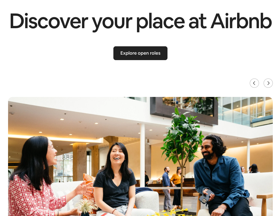
Airbnb often uses human beings to create a simple and welcoming entry point.
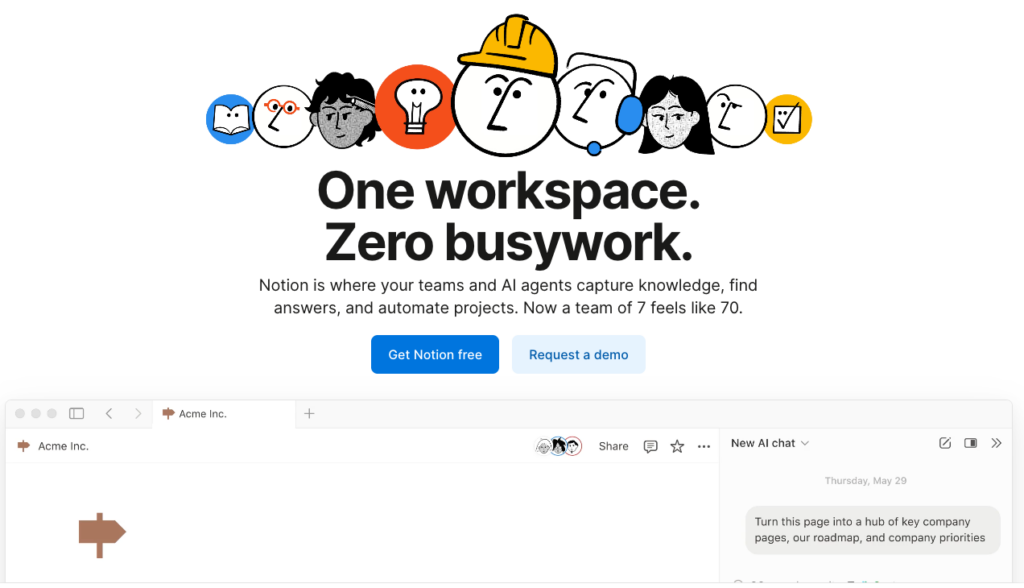
Notion goes even further with a very clean opening, where we mainly see the structure and the intention.
What interests us in these examples is not the style, but the way in which the header supports the message.
In our own projects, we follow the same logic: several directions, rapid testing, and a progressive selection of what is clearest, most coherent, and most... just for the page.
Key takeaways
When we talk about hero banners, it's not about deciding for or against a large image. The question is rather about understanding what we want to convey in the very first seconds and under what conditions the user will discover the page. Some projects lend themselves very well to a visually open design. Others gain in readability with a typographic header or a more modular structure. There's no single right answer. What we take away from this is the importance of maintaining control over three essential points: the immediate understanding, there performance, and the consistency between what is shown and what is told. A homepage works when these elements align naturally, without forcing a template.
If you are rethinking your homepage or are hesitating between several directions, we can help you: clarify the intention, test several approaches, find the balance between message and performance.
This article was co-authored by Tiffany ROCHETTE And Maxence FREIXA.
The article Hero Banner: Alternatives and trends for a more impactful design first appeared on Usabilis.
