
The ergonomics of UI maps: guiding the eye to provide better information
As a product designer, I have a particular fondness for cards. They're components I use very often in my projects. Their strength? They function like small, condensed pages, easy to organize in a grid. Visually, they remind me of Polaroids…
Educational objectives
- Understanding the key concepts of "UI map ergonomics: guiding the eye to better inform"«
- Apply this knowledge to your UX/UI projects
As a product designer, I have a particular fondness for cards. They're components I use very often in my projects. Their strength? They function like small, condensed pages, easy to organize in a grid. Visually, they remind me of the Polaroids of my childhood: those snapshots I annotated and pinned to my bedroom walls.
This analogy perfectly illustrates the value of cards: they bring together essential information in a visual format that is both structured and flexible. That's why I chose to write a best practices guide.
Whether you are designing a software interface or a website, cards are a particularly effective pattern for presenting data — provided you use them correctly.
The right map format: its impact on reading and eye fixations
The choice between a vertical map and a horizontal map is not neutral.
A vertical map promotes a natural, top-to-bottom reading path, thus reducing cognitive effort. It is particularly effective when the image is the entry point, as it immediately captures attention before leading the eye to the text.
The horizontal map, on the other hand, fragments the view more because it requires frequent lateral movements. However, it proves better suited to longer texts, as it offers superior reading comfort thanks to more spaced-out and legible lines.
In ergonomics, it is therefore important to remember that orientation should be chosen according to the dominant content in order to minimize cognitive load.
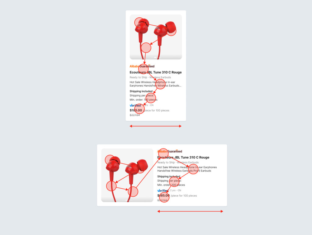
Examples of vertical and horizontal maps
Optimize mobile display
On mobile, the issue of space optimization becomes even more crucial.
Horizontal maps limit vertical scrolling and reduce the cost of navigation, while vertical maps fit better into column grids, but at the cost of sometimes excessive scrolling.
The primary gesture on mobile is scrolling. To avoid visual clutter, it's best to choose a vertical format for most cards, which fits naturally into a feed. The horizontal format can be used with horizontal scrolling (a "carousel"), but only for supplementary content, such as suggestions.
Making a card fully clickable simplifies user interaction, especially when only one action is associated with that card. This design choice reduces cognitive load and encourages users to interact more easily with the content. By offering a larger clickable area, you make the interface more accessible and responsive, thus streamlining the user journey.
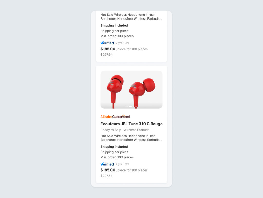
Examples of map display on mobile
Structure the information in the map
The internal organization of the card also determines its effectiveness. Essential information, such as a product photo or a price, should be highlighted in highly visible areas, generally at the top or in the center.
Highlight key information
Identify the most important elements, those that most influence the user's decisions.
For example, in a product description, the image, name, and price are the key elements that trigger interest or rejection. These elements should therefore be given greater visual prominence, with a larger image and ample margins around it.
Horizontal dividers can help distinguish unrelated elements or highlight the hierarchy between them. However, they are rarely useful in map design. Instead, use typography and negative space to create distance or make content stand out.
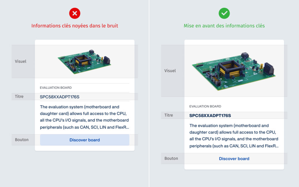
Example of highlighting key information
Quantitative data (secondarily important)
The quantitative data shown on the maps plays an important role in the user's decision-making.
Avoid placing them between the title and the description. Ideally, place them at the bottom of the card, visually separated, or above the price.
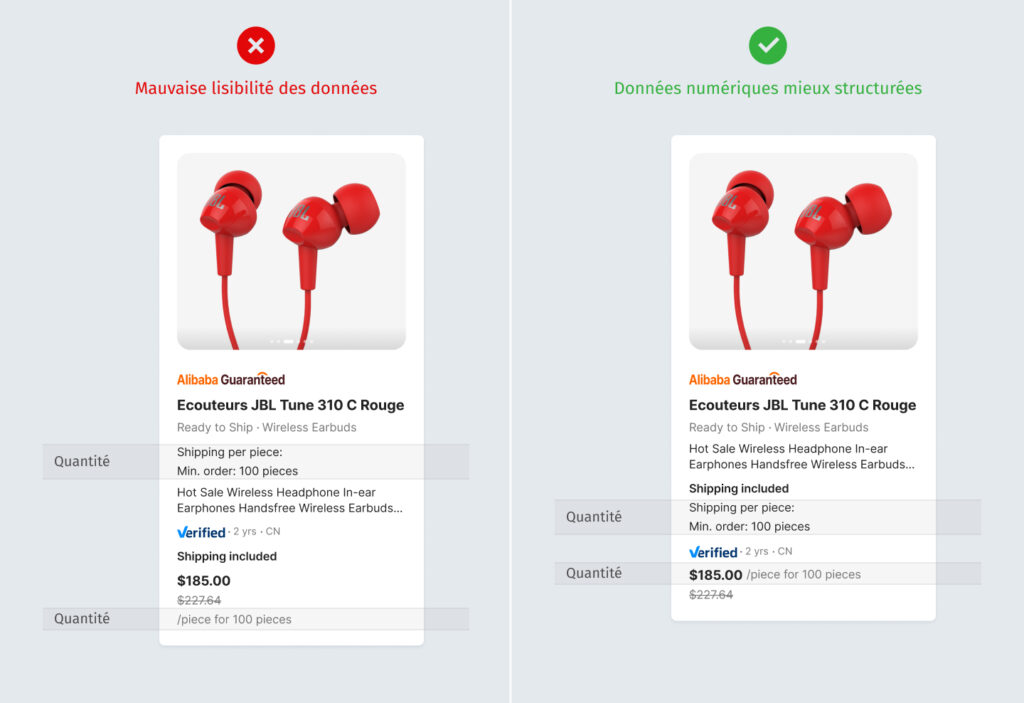
Example of quantitative data
Metadata (tags, categories)
Labels such as the ad type are important, but they are not part of the main data. They need to be visually distinct. Therefore, it is advisable to display them in a separate corner of the map, as colored chips, to indicate that they are categories and not descriptive information.
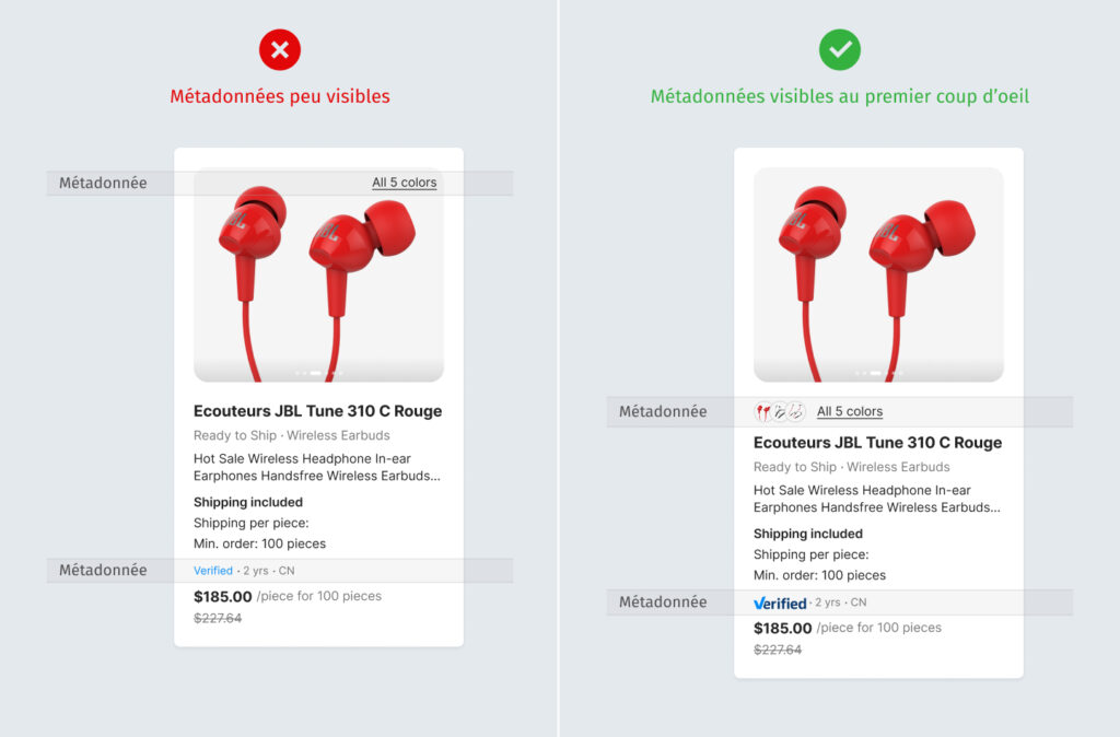
Example of metadata
Height management and autolayouts
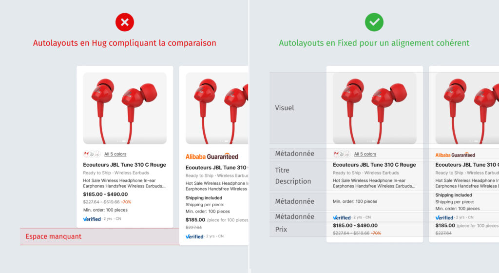
Managing height plays a key role in the readability and comparability of information. If each card adapts freely to its content, the resulting display can be inconsistent, with titles, numbers, and buttons no longer aligning from one card to another, complicating comparison. To avoid this, it is recommended to define a fixed size for certain internal elements (for example, header height, content area, and action placement). This way, even if the density of text or data varies, visual cues remain consistent, allowing users to quickly compare cards.
Autolayout complements this logic by managing the spacing, alignment, and distribution of internal blocks. For example, you can fix the height of the map header and footer, while allowing the central area to adapt slightly to the content. This combination maintains a consistent structure across the entire map array, while preserving flexibility in data display.
Height management and autolayouts
Autolayouts Hug
1. Determined by content
2. Variable, adjusts automatically
3. If the content grows, the map stretches. If it is shorter, the map shrinks.
4. Inconsistent display, making data comparison difficult.
Fixed Autolayouts
1. Predetermined
2. It always remains the same
3. Content that exceeds the limit may be truncated, hidden, or create an overflow.
4. Uniformity: all cards have the same height
Comparing the two height management systems
Conclusion
A well-designed UI map is more than just a graphic element: it's an ergonomic tool that reduces cognitive load, facilitates navigation, and prioritizes information intuitively. By guiding the eye, clarifying priorities, and supporting decision-making, it becomes a true driver of cognitive efficiency, enhancing the user experience.
Key points to remember
A vertical map promotes smooth reading and highlights images, while a horizontal map is better suited to long texts.
On mobile, vertical maps integrate well into the user flow but generate scrolling, while horizontal maps reduce scrolling and work well in a carousel format. A fully clickable map simplifies interaction, reduces cognitive load, and improves accessibility.
Key information should be highlighted, secondary data grouped in a map footer, and metadata presented separately.
The balance between fixed-height elements (ensuring alignment and comparison) and adaptive sections via autolayout (ensuring fluidity and accessibility) is the key to an efficient and scalable design.
This article was co-authored by Nathalie TRAN And Maxence FREIXA.
The article The ergonomics of UI maps: guiding the eye to provide better information first appeared on Usabilis.

